The subscription page shows me this text for what I’m purchasing:
Full access to all traditional components, characters, and vocabulary while your subscription is active.
I’m guessing you are missing a " and simplified" in the middle of it … somehow I doubt you won’t give me the simplified characters if I sign up. Surprised me though seeing that text when I’m set to only study simplified lol.
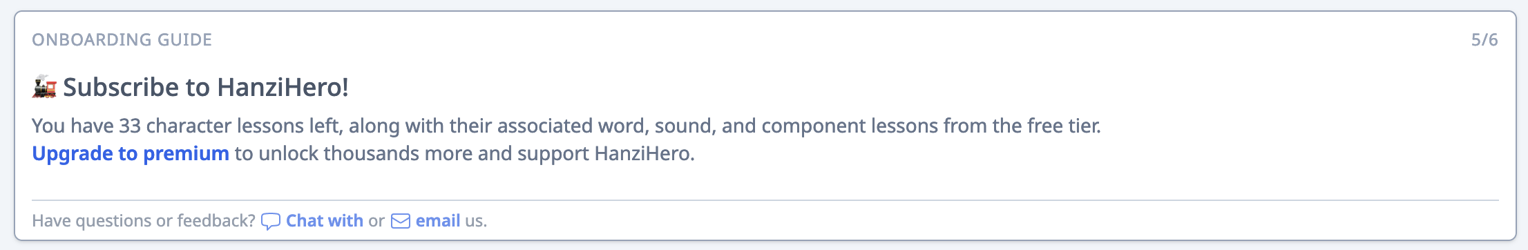
(PS. If I haven’t signed up yet why isn’t there a “Subscribe” option in the top menu bar? To even find the sub page I had to click on a link in the “Onboarding Guide 5/6” banner that took me to the docs page, and from there I had to find the paragraph that talked about a price page and click on the link there which told me I could try for free … but I’m already signed up and I had to find the OTHER link to the “Subscription page” … don’t you want my money? Why make it so hard to find? When I finally found the subscription page it has all this other info in the bar that I normally don’t see.
The “Subscription” page and the “Product” page are completely missing from my normal bar. If I haven’t subed yet put both of them in my bar:
Yeah, that’s outdated I’ll update that. You get access to both courses
This made me laugh
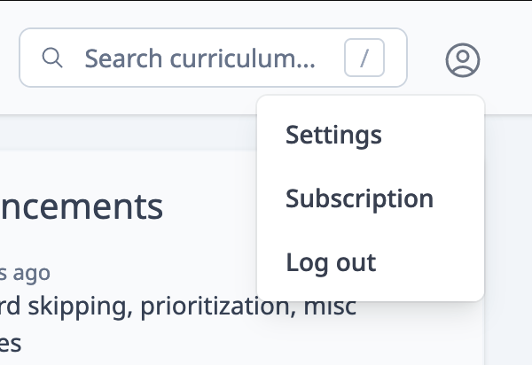
Good suggestion! There have been issues of discoverability when it comes to accessing the user settings:
It’s a pretty generic icon – maybe if we supplement with a mascot profile picture or something
No problem, glad it’s working out for you thus far! Feel free to reach out if you have any additional questions through the chat widget or through the forum
Sample size of 1, but I wouldn’t go look at my profile/settings page to sign up to something. I’d go there to cancel, or to check how long was left before sub renews (I’d also go there to change my password, set timezone and tweak settings it etc), but not sign up.
On every other platform I’ve tried the signup button is huge an obvious. e.g. here’s LinQ home page title bar (a service I’m not subbed to):
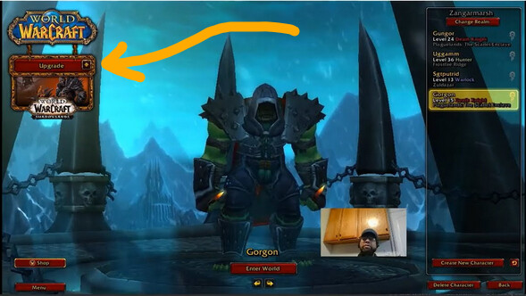
Giant orange “Premium” button. Biggest most attractive thing on the screen outside the lessons themselves. It also stays there even while I’m doing my lessons so is inescapable. Fluent U is similar with a permanent blue footer with a big “Upgrade” button on it. Even World of Warcraft when you’re not signed up and playing the trial version has a huge “Upgrade” button on character select:
Not that you have to just copy what others do, but as someone who’s tried a few of these sites, generally the subscribe option is front+center, and I don’t remember ever going to my profile to sign up to something (hence it didn’t occur to me to look there).
Good points! It’s strange for us to not move the subscribe button front and center We do have that banner you mentioned – putting the big button there would be a good idea. It’s strange how the link within the banner doesn’t even go to the subscription page! :