Seems like UX wise it could be possible. Just an idea that I sometimes would find useful to correct bad ways of spelling. Directly allows me to improve my English.
I think the reason we went with the current design is so it serves more as a “notification” which prompts one to check against the label underneath the card.
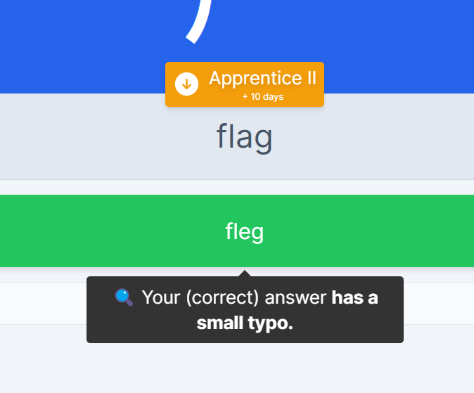
As in your screenshot, we thought “flag” was in close-enough proximity to see where one may have made the typo. I can see how maybe having it as bold and the same font size within the closer popup would make it easier to spot the a ↔ e mixup though
I see. Yeah, this is a superficial example, incase of missing the ‘C’ here: occurrence is quite an easy one to miss and not always that obvious to nonnatives.
But yeah the information can be checked by clicking the ‘info’ button and so on, this can help giving the feedback a bit quicker tho.
You mean instead of changing the popup having the text box it self have the corrected version where the place of the typo is marked as bold text? That sounds good to me too.