Hey. Another quick suggestion: I keep running into the problem that I type pronunciation when it wants me to type the meaning or vice versa because if I’m doing 160 reviews in a day that take me 30 minutes, I don’t want to keep reading whether I should do the meaning or pronunciation. That’s just not where my eyes are focused, so I keep making that mistake which costs me a lot of time.
So I want to suggest: Would it be possible to put a little speaker icon vs. a question mark icon right next to the character so that you see which one is required right away when looking at the character without having to move your eyes and read something? I think that would actually drastically reduce the amount of times I make that mistake.
Maybe some other people can comment what they think.
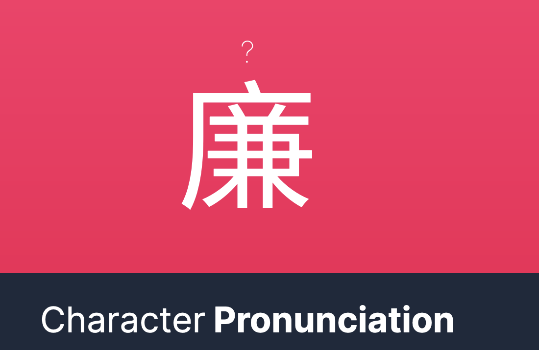
We actually have a little question mark “?” next to the character for this for all pronunciation questions! Meaning questions won’t have it. We added it way back when we ran into the same problem ourselves.
It’s a bit small though and not immediately obvious. We’ll look into changing it to be a speaker icon or ear icon instead of a question mark maybe. I’ll file a ticket on our end to look into this.
If changing, perhaps it’ll be more helpful if - rather than just use one symbol for pronunciation questions - use one symbol for those and another symbol for meaning questions. For example, a ? icon for meaning and a speaker / er icon for pronunciation.
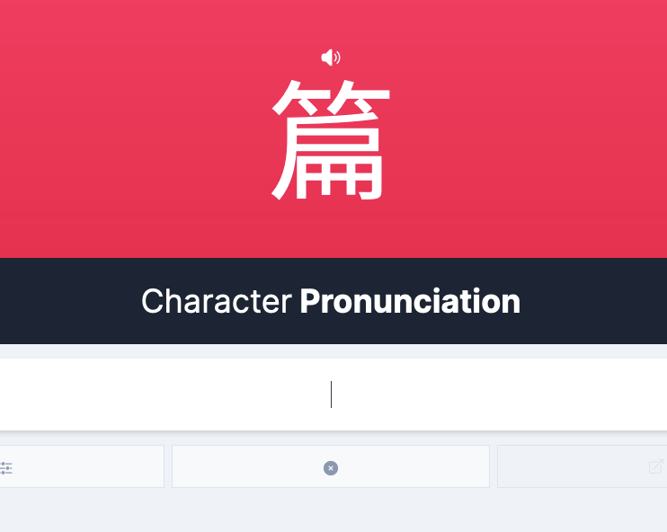
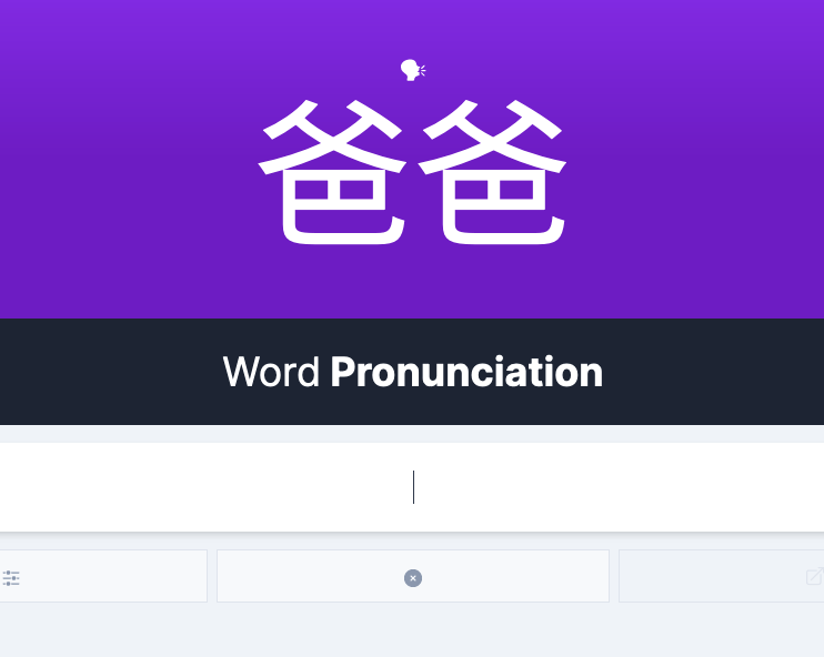
The question mark was rather thin and isn’t immediately obvious that it’s correlated to pronunciation questions, so we’ve switched it out for a speaker icon:
I couldn’t find a satisfactory icon for meaning questions–in addition, I think moving the question mark to meaning questions would confuse users who were used to correlating the question mark to pronunciations
Let’s give the speaker icon a spin and if someone wants to suggest an icon for meaning questions, I’m all ears
I must admit I’m not quite happy with the speaker icon. It looks exactly like the general UI pattern that tells me whether something is making a sound, or requiring me to listen:
macOS system volume:
Safari:
I’m not sure whether I actually consciously noticed the question mark, but after the change I’m actually being significantly slower at giving the pronunciation vs. the meaning. I feel I’m listening for something that never comes.
I would suggest changing it to a “person talking” sort of pictogram, e.g. something like this.
Yeah, I can see how the icon can be distracting when you just want to focus on the character
I browsed around and couldn’t find a satisfactory one that didn’t look strange when placed above the character due to jagged lines or being too wide/detailed
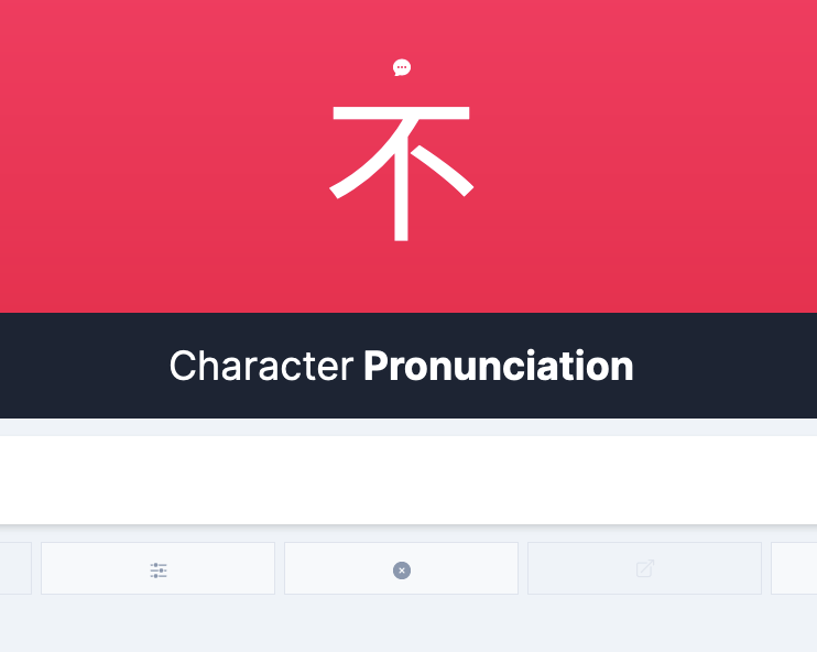
The next least intrusive icon I would figure to be a speech bubble:
One concern I have for having an icon for both meaning and reading is that the icons look too interchangeable at a glance. But in terms of semantic meanings, lightbulb is a good idea!
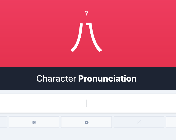
One more alternative that doesn’t seem too intrusive while still registering it’s a different question would be to increase the thickness of the question mark:
I think speech bubble could work. Otherwise I’d probably prefer the good ol’ question mark, purely out of habit. But both lightbulb and question mark are actually a bit ambiguous when either side of the card is technically a question