We’ve been working on a redesign of the Lessons/Reviews.
Our primary objectives were to improve the new user experience, increase review retention, and add some extra encouragement to get through your backlog each day!
Toward those ends, this redesign aims to:
Make the UI more mobile friendly. I think the steppers are quite fiddly compared to a button.
More visuals, less words
Make it feel more like a videogame, clearing up the backlog more fun
Actually find a way to test your understanding of your Lessons, by waiting on them longer. The current Lessons quiz design tests too quickly and thus does not test your memory.
Merging the Lessons/Reviews also simplifies the app, prevents the error of queuing up too many Lessons without getting through your Reviews, and makes the decision easy: just press the Study button.
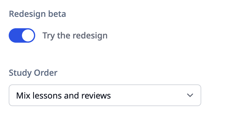
For those concerned about ordering, we introduce a new “Study Order” setting which allows you to put Lessons first or Reviews first. Though I’d recommend trying the default “Mixed” option before switching!
Excited and curious! I also appreciate the additional visual distinctions between prompting pinyin and meaning that you’re trying out here.
One large turn-off for me on mobile currently is that each item is forcing my keyboard to close (on Android, Chrome). This means that on every single item I have a new additional step (hit the blank field to summon the keyboard), which adds quite a bit of clunk to what is often a very smooth experience otherwise.
One medium concern for me is that this seems to drop the ‘clock’ feature (the ‘wrap up my review with remaining requirements for any items and don’t review new ones’ feature). I get that the progress bar probably needs that tradeoff to some extent, but I do currently make extensive use of the clock feature for pacing out my reviews as I see fit.
One small quibble (again, mobile) is that the characters seem to be slightly smaller than they would otherwise, but that could easily be my brain adjusting to the new layout.
Thanks for being so willing to take big swings with new features
I just tried out the feature and thought it was great! however I had a few complaints I wanted to offer feedback on but turns out you already posted everything I was gonna say (except that last point, it is a little smaller but for me it felt more sleek than problematic)
Just did my first session on the new system, I think this is a great improvement and total overhaul. I had already done my reviews before switching so I am curious tomorrow how they will integrate together, but even just the new material by itself feels much smoother to get through and I like the way it mixes up during the early reviews. Seems like it will be better for retention. Great work! I am glad this app exists while I am learning Mandarin.
I’m obsessed!! Truly the UI Olympics. Great job! The ending screen where you have all of the views, and the option to review again?? chefs kiss frfr
Thoughts/suggestions:
When a new character is being learned, the mnemonic pours in word-by-word, like watching a chatbot reply, or like dialogue in videogames. For the sake of browser graphics / computer graphics, it’d be nice if there were a “reduce animations” setting so that it loaded all at once. This is a “nice to have” as opposed to a need.
It seems that I can’t skip a character or word after its initial presentation. Example: I get a character, and I tab forward to its mnemonic or definition, I can’t, from there, hit ctrl + d to skip it and not have it count toward my daily learning count. Having the option to skip in the middle of a lesson, and/or an option to go back to the start of that item in order to skip it, would be great. I’m not sure if I simply didn’t notice it, but it seemed like the skip button wasn’t there (and ctrl + d didn’t work mid-lesson).
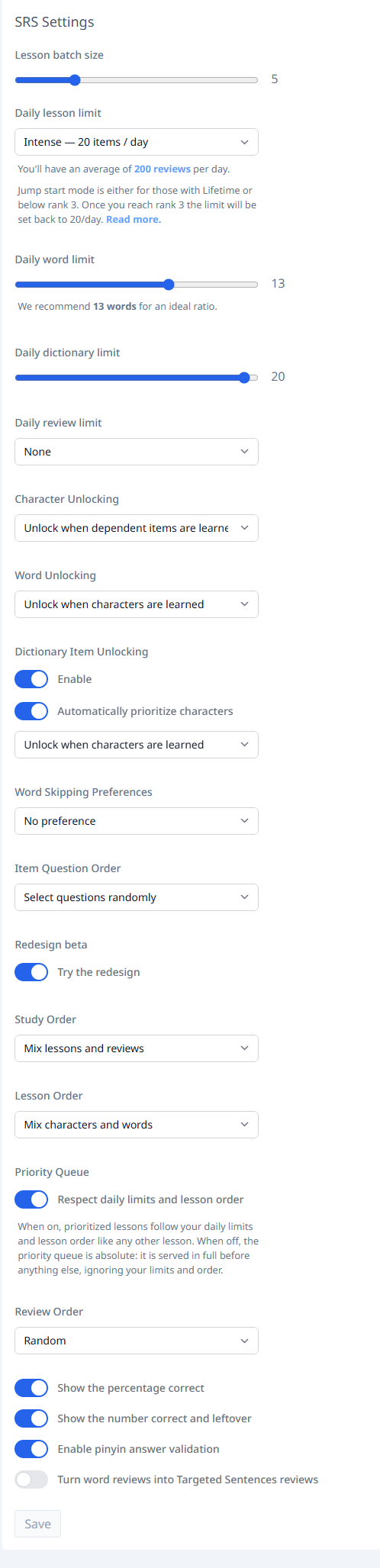
I’m not sure if the “mixing” is working as intended or if I just don’t have my settings correct. It seems that despite my setting it up for as much randomness as possible, I still ended up having most if not all of the lessons after my reviews. Here are my current settings:
edit: on second thought, this last bullet point might be because I just don’t have a lot of items for review at the moment since I recently reset my progress! Since today I only had about 10-15 items for review, that might be why it felt this way.
I tested it already and I like a lot the recent changes. It works way more smoothly. I love the progress bar.
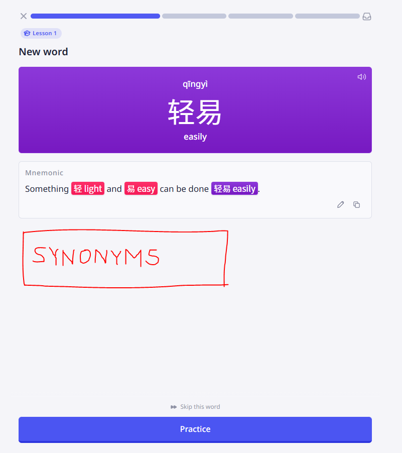
There is just lack of one very important functionality: synonyms. Due to the fact that English language is often very ambidgous all the synonym words really helped to understand what is it about (light as weight or light as energy).
Plus what is very important for me: I always “abused” the synonym system to add meanings in my own native language. So I avoided double translation.
I agree, the MacBook experience (13’) feels a bit small, as if I’m on a mobile-first site. Especially if you have the sentence review feature turned on.
Tried the new update today. Appreciate you putting in the work! One note, I usually review on desktop. A few points of feedback:
The mixed order was not mixing very well. I did my reviews in sessions today and when I switched over, I had 40 reviews and 15 lessons. I had one lesson after ten reviews, then another after 20, then 30, then rest all came at the end. I’d want them to actually be reasonably distributed because I agree you need like a ten minute gap to actually test retention of these new items. This is the biggest improvement.
The “X” button disappeared. I preferred that to typing in a wrong answer.
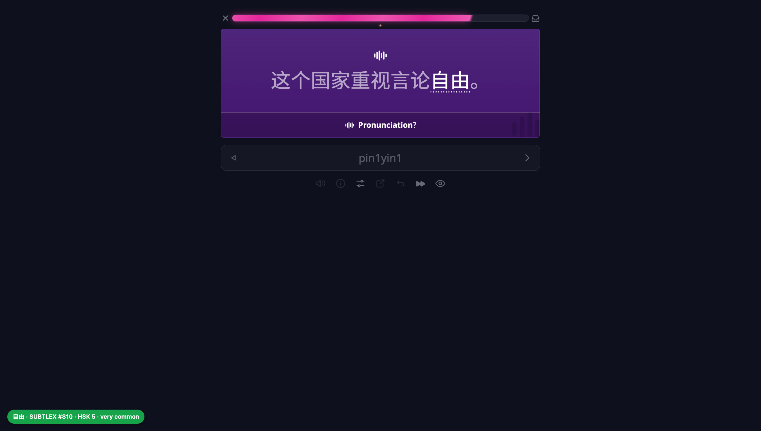
I don’t see the HSK level when learning new items. I always look at that when learning new words.
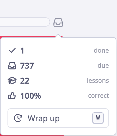
I know you hid it behind a hover, but I prefer being able to see the number of reviews remaining.
I’d also like to be able to turn off the animations. They’re cute but will probably grow old over thousands of lessons and reviews.
I’d love to just be able to turn on the mixed order with the old UI. It kinda fits my learning style better and is faster/simpler.
Also, I’d love a setting to be able to automatically mark non-primary pronunciations as wrong. If I accidentally submit a secondary pronunciation, I have to undo the card, remember to intentionally get it wrong the next time I see it, then finally get it right on my third view.
If you’re on a keyboard, then ctrl+enter is the shortcut key for instant fail of the current item.
I also miss the HSK level of items.
Greatly appreciate the work. I’ll save any other thoughts for next week once I’m sure of things actually bug me (instead of just being different and I’ll get used to it)!
I honestly thought it was just the right amount of ‘video game’ before, and we’re now straying into the realm of feeling patronizing. I don’t need confetti, I’m desperately trying to just memorize every day.
I never learned them in the Lessons quiz, I do extra study lessons, sometimes 4 or 5 times, before I do my daily reviews. The actual “test” after daily lessons is just the first nudge to get it to stick which means that…
… merging them together doesn’t help me at all. It just frustrates me, having a bunch of things I’ve had no time to study for, suddenly forced into my daily reviews. It throws me off my flow.
I feel like I should add though, none of this is a deal breaker and whatever most people like is fine. Just adding my immediate thoughts. I appreciate everything you guys do at HH.
I think we will add options to skip or speed up the animations. Or at least easily skip them with [Enter], as that is some feedback I myself had as well for the initial beta after trying it for the past couple days, even before it was publicly released.
That is one of the main issues we are trying to solve. The current lesson flow is unfortunately contains a lot of filler text. This deters new users a bit, and for existing users this filler text is just completely glossed over afterwards because it is more or less inessential. This leads even us to sort of skip over the current lesson flow a bit, which is what inspired us to do this redesign.
Our main aim with the re-design is to make the lessons more clear, especially to new users who may not understand the sound/component composition concept. By having an animation of the sound/component breakdown, and also for sound/component lessons having a little indicator of why it is being learned right now (e.g., “月 component is part of 朋”), we hope to improve this a bit. At least, that is our aim, but we will need to continue testing and improving it to work slowly towards that goal.
The redesign has a “Study order” setting, so one can set the lessons to be at the beginning or at the end, if one wants to do lessons first or reviews first. We may add some more functionality here, but one can replicate the old Lesson/Review split by just chosing the respective ordering option in the setting. For example, if one only wants to do Reviews, one can just make lessons at the end. Or, as before, we have the “Daily lesson limit” setting as before for granular control over number of lessons.
Thanks for the feedback! The main reason we are releasing this as a beta is because we are still iterating on it. We have a long queue of improvements we will be working on as it is in beta, many of them sourced from this thread.
Yeah, the current mixing isn’t great, partly due to us trying to having these batches of reviews. We will need to rethink that part a bit.
It is now an . We will think about the best icon for this, it may still be . Sometimes I think a white flag icon could also work (as in “I give up, show me the answer”).
There is a lot of other feedback in this thread I have not replied to yet, but we have read through all the feedback and written up a list of things to alter this week. Thanks again!
I’m so glad you already had me covered with this. Todays reviews I’ll do with that feature set to “Reviews first, then lessons”. It should be pretty much how I usually study daily then. Thank you!
I’m sure the team at HH has a lot more information than I do, but from my perspective the “new lessons” are just the unlocks for the next day. I know I’m going to need to do numerous extra study sessions (which is always on the next day, after I’ve slept on it) before the new lessons actually stick in my head. By the evening, when I sit down to do the Daily Reviews, the new lessons from the day before have finally become automatic.
I guess what I’m saying is that merging the daily reviews and daily lessons doesn’t seem to actually help someone like me memorize them easier than it was before. I learn through endless repetition.
BIG ‘but’ here, though: if it helps on-board new learners then I completely support it.
This is a fun update. The “fake” chunking makes it a bit more fun. I personally like separating my learning phase from my reviews so I’m glad that functionality was somewhat preserved, although it’s a bit awkward and I did like doing smaller learning batches (5 at a time) so that is missed.
My main piece of feedback:
For me, seeing the words a character is used in is a huge motivating and educating part when learning a new character. Oftentimes, the single word used to explain the character is somewhat ambiguous, synonyms disambiguate a little bit, but seeing what words it is in helps immensely. It also motivates me when I see some valuable words I’m closer to “unlocking” by learning there character. Sometimes I’ll remember a character simply because the words in are memorable.
As far as I can tell that is missing here completely.
There is a “review again” button. Could this be retained throughout the day? Often after reviewing 100 cards I don’t have the energy to review again, and it would be less impactful than review a few hours from then.
Also I have yet to try this mode out with weak / limited internet but hoping there are some changes under the hood and this will be more low-internet friendly since I’m frequently stuck in my reviews when doing them under intermittent connection (which is my daily).
1. As stated by others, I would prefer if the desktop view could fill the whole screen.
2. I would still like to be able to see total reviews left rather than having to hover over the box icon to see it.
3. I would prefer if it didn’t automatically give you the correct answer so that if I make a typo, I can undo it and still make my guess without having seen the answer.
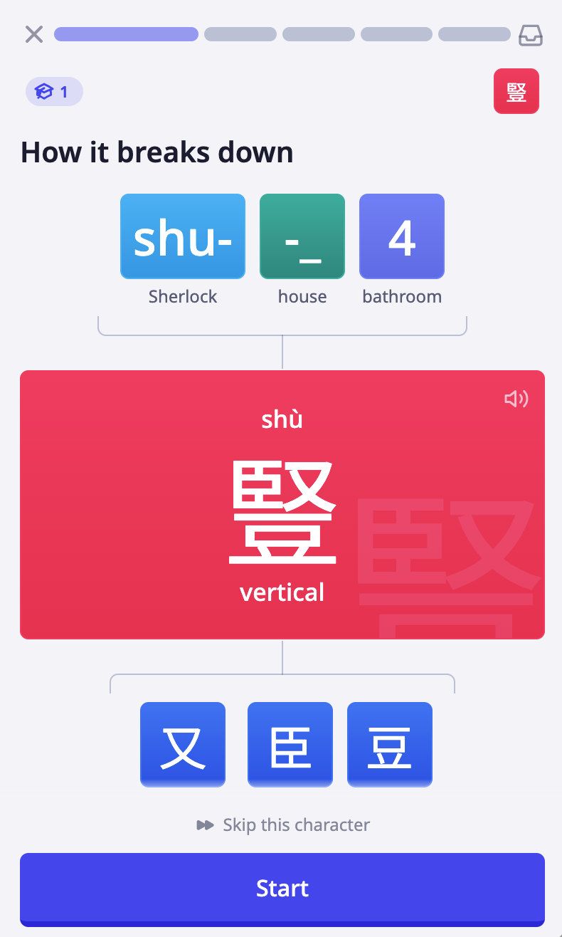
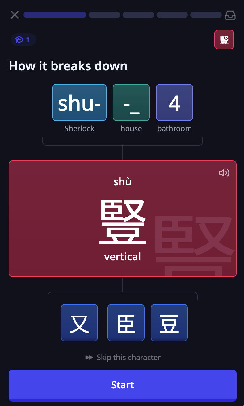
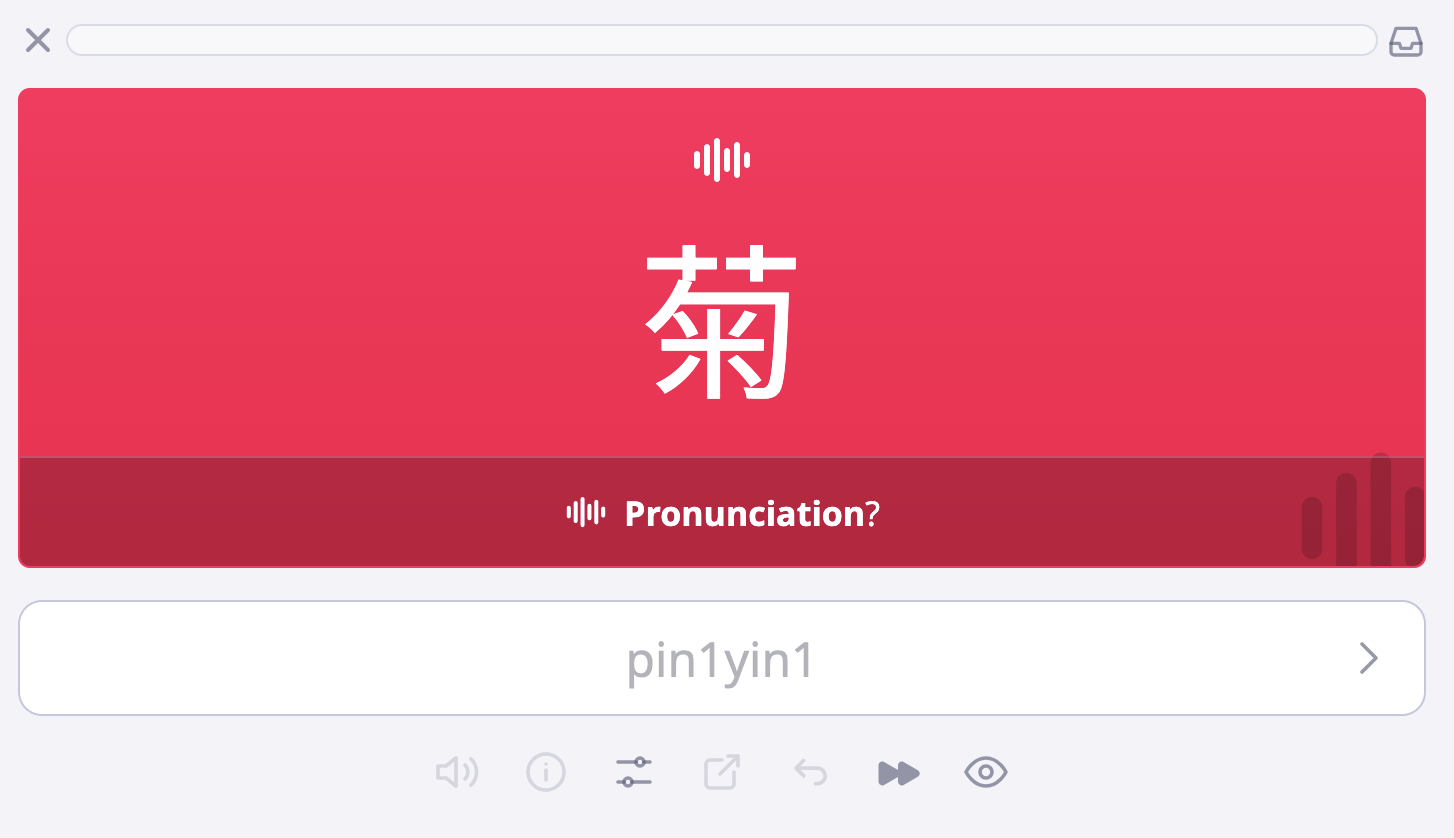



 And the interface feels pretty comfortable
 I’ve found if you use it enough, you get used to it.
 . We will think about the best icon for this, it may still be
 . Sometimes I think a white flag icon could also work (as in “I give up, show me the answer”).