🏔 Lesson Summary, SRS stage updates

Hello again :slight_smile:

Just thought I’d share a few things we’ve been working on – things you’ve probably already noticed but I’m sharing now :sweat_smile:

Lesson Summary

Previously when you completed lessons, you’re only presented with an option to either learn more or go back to the Dashboard. It makes it hard to figure out where exactly you are in the course, or what you just accomplished, or what’s up next.

So we added the Lesson Summary page which covers those functions :sunglasses:

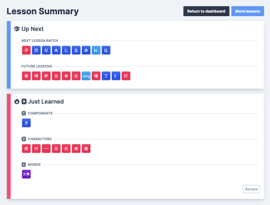
When you click on the “Review” of the Just Learned, it will only review the items listed even if you have an additional +40 items back on the Dashboard. We plan to extend this “isolated study” ability to the Recently Learned & Recent Mistakes on the Dashboard soon!

SRS Stage changes

The previous SRS stages were too close in colorschemes. It was difficult to know at a glance whether you were on Iron, Silver, or Platinum – especially from the List pages.

In addition, there wasn’t a way to visualize how far along you are amongst the stages. There was a list of numbers on the dashboard, but it’d be nice to add some graphs to that.

So we’ve done a few things:

Renamed the SRS stages

Seeing as we can’t really work with the current colorscheme, we ditched the names altogether. The new SRS stages are.

  • Novice
  • Apprentice
  • Journeyman
  • Expert
  • Master

You will see these new labels within the Review Quiz, attached to a roman numeral. You can learn more about the stages within the docs.

Using a new indicator on the List pages

This one took a bit to figure out. We can’t use the new (now distinguishable) colors because of all the different item backgrounds. What may look good on red won’t look good on teal, etc. You would just see a bunch of distracting colors scattered across the screen.

After toying around with some abbreviations (e.g. A2, E1, etc) or using pie circles, segmented circles, etc, I found this to be the least intrusive but also the most “glance-easy” way to show the SRS stage. I took inspiration from Mahjong, actually :sweat_smile:

image

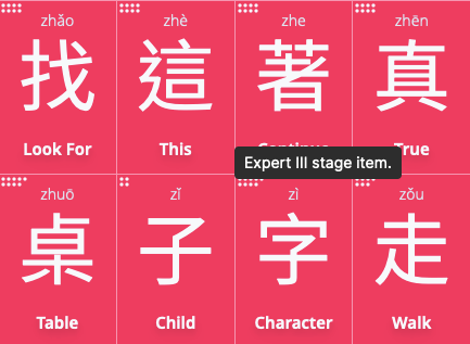
Each circle corresponds to one “rung” on the ladder of the SRS stages. e.g. two circles would be Novice II, while four circles would be Journeyman II. You can always hover over them to figure out the stage too.

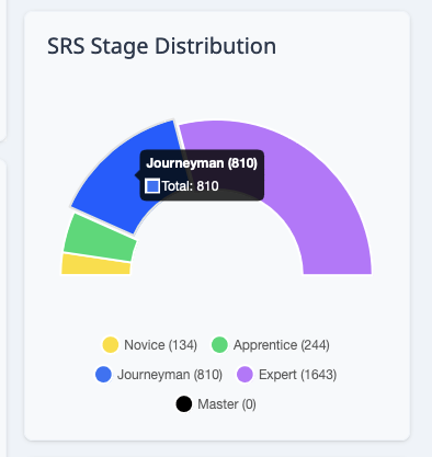
Updated the SRS Distribution widget

Having a way to visualize your distribution rather than dealing with raw numbers is a lot more satisfying. You can see the colors associated with each stage here too.

image

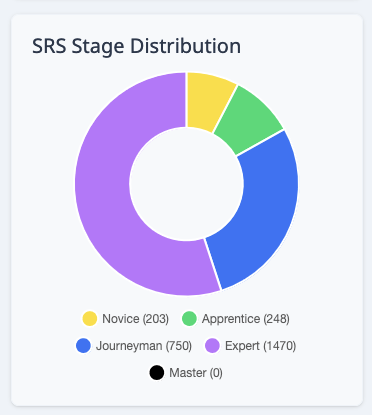
Further improvements would be to break down each SRS group into its individual stages, e.g. a way to see the distribution of Novice I and Novice II :slight_smile:

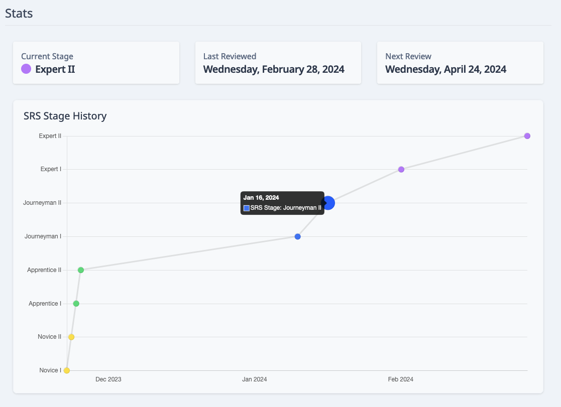
Added SRS History to each item

With the new SRS stages and colors, we finally could add some visuals for the SRS history of each item. We also moved down the SRS stage label to the Stats section:

Misc Updates

Related items listings

Previously on Item pages you were greeted with the entire list of related items. To make it so you can scroll to the Stats section in a reasonable amount of time, I’ve added some loading behavior to any related subject sections:

Word Examples test suite

Thank you to those who report some of the pinyin errors they may have found!

Sometimes an additional letter would slip through our pinyin for the sentence. Now we have a comprehensive test suite which catches any anomalies/divergences so you can feel more assured that you don’t have to look out for typos while learning :slight_smile:


That’s all for now. Happy studying!

10 Likes

I love it all.
Keep up the good work making this the best site ever guys!

Also, I love the “shhhp” sound when I go back and correct a mistake. I didn’t realize before how nice it is to have that auditory confirmation for the changes I make. It’s nice~ thx. And thanks for all the improvements. It just keeps getting better. :slight_smile:

2 Likes

Yeah I really like this page. I still wish we’d have the retention rate [number of cards answer correct on “both sides” / total number of cards] on the upper right.

So on one hand, I agree the mahjong theme looks pretty sleek, and is absolutely fitting thematically. I however wish there was a stronger indicator here. 6 total dots and below is pretty easy to distinguish, but once you get to like 7vs9, that’s starting to get a bit hard. Have you tried grayscale? You could have a different shade for every named stage. That, or perhaps for Master alone you could color the dots dark grey - black. Something to indicate “I’m DONE”.

Oh that looks pretty cool. The only thing I wonder is, could this sort of thing be somehow expanded for groups of items (or every item), so we could better understand the lifecycle of an average card. Perhaps this is way too deep in the analytics for the average user, but here are some idea’s I had. On e.g. the Characters->filter by HSK level 3 page we could have a minimized by default tab with

  • Days till nth-rank: for every stage n, plot average[days from learned till item first (or perhaps latest) attained stage n]
  • Typical rank at nth day: for every day n, plot median[rank] (could also due 25%ile, 75%ile)
2 Likes

I definitely agree that past 6 dots it’s harder to glance at. I’ll see what I can do to make it more obvious :thinking:

I’ll see how that looks :slight_smile: another idea is to have a different shapes, though I wonder if it’d be easy to distinguish the shapes :thinking:
Another solution is to somehow fit it into 3 rows instead of it being two long rows. The reason I went with the two long rows is so it doesn’t clash on some of the tiles, but they can be squished together a bit more.

I like the idea of merging the filters on the list pages with some drill down analytics :slight_smile:

But I wonder if it’d be too crowded. Are there other filters you would like for these graphs other than HSK level? I can see us adding more statistics on the Dashboard, or having a dedicated “Statistics” page since the Dashboard is getting a little cluttered :thinking:

1 Like

That was a fun sound to find :laughing: I think it’s free audio of velcro, if I recall correctly. Or paper tearing!

We want to add a few more sounds, like a congratulatory trumpet at the end of the Lessons. If anyone has any suggestions for other fun sounds they’d want to hear, let me know :slight_smile:

1 Like

Sound effect upon mastering an item, like some kind of brief low pitch bell ring.

1 Like

I think that previous stage distribution was better, I could clearly which level comes after another and how many items I have in each level.
The problem that in the distribution graph in the pic youve provided the expert stage is connected to novice state which causes that its harder to see which levels are better and which are not.
I think that old tile-style was better, but its my preference

2 Likes

You have a point here :sweat_smile:

I updated the graph to use a half-donut instead so it clearly demarcates the tiers of each SRS stage. Hopefully this helps with keeping a clear hierarchy in mind :+1:

image

3 Likes

That looks good! Thanks!

2 Likes