In the “Launch Extra Study Session” modal that opens when you click the “Review” button in the “Recent Mistakes” section on the Dashboard, the ghost icons that indicate problem hanzi/words are covered by the checkbox input so I can’t see what I should really focus on studying. In the screenshot I posted you can see just a few pixels of the ghost icon under and slightly above the checkmarks on ke4ben3 and de2. The ability to select only items marked with this character for review would also be very appreciated.

Thanks! I wonder what’s the easiest way to fix this  I guess when the checkmark is rendered, push any sort of status below it? Could also fade in/out the checkmark on hover
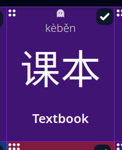
Thanks for the quick response! Here is one option that I think works well at keeping everything separated. I’ve modified the CSS of the ghost icon so that it retains the absolute positioning but centers it through everything in the “style” property (margin-inline, left, right). I tweaked the “top-[2px]” class name to “top-[1px]” in this span as well.
<span title="This item is a leech." style="margin-inline: auto;left: 0;right: 0;" class="hero-ghost-solid opacity-80 top-[1px] absolute z-10 h-3 w-3 text-white select-none"></span>
I also modified the “right-[4px]”, “top-[4px]” class names in the checkbox input to “right-[1px]” and “top-[1px]” to more closely match the spacing of the proficiency dots in the upper left corner.
Shrinking the ghost icon a little bit also makes the spacing look better. The ghost icon has “h-3” and “w-3” class names in the screenshot below instead of “h-4” and “w-4”.
2 Likes
Your suggestions worked out perfectly, thanks! They’re now implemented
I was tempted to try out the spacing differences on tiles outside of the Extra Study, but decided to hold off for now… the current sizing on the status icons seems okay
Awesome, thanks for doing that!
1 Like