HanziHero now supports both light and dark mode!
The first option respects the system’s settings, while the other two force the theme local to the device.
Please let me know if you run into any parts of the app that have not yet been updated to respect dark mode, but hopefully everything was covered
Thanks again to everyone for all of the feedback – I have a few items that I hope to get to from previous threads, stay tuned!
I noticed it on my phone last night and thought maybe it was just a mobile browser edition, until I saw it on desktop a little later! Love it.
I’m usually the odd one out because I prefer light mode for almost everything (coding, twitter, teams, etc.), but for this, the dark mode is much easier on the eyes. Personally, the pink and the blue for characters and components in light mode hurt my eyes, so I’d turn down the brightness on my computer lol. I think it’s just me though because my eyes are more sensitive to light.
Thanks for the update! This makes late-night reviews a lot easier on the eyes
Here is an idea/suggestion for improvement regarding the question label (I mean the bit that says ‘ Character meaning?’ or ‘ Character pronunciation’).
In light mode, this bar has two strongly contrasting colors, depending on whether the pronunciation or meaning is asked for. In dark mode, the colors are currently very similar, and I now realize my brain is heavily conditioned by the color when deciding whether to start typing pinyin or English. I find myself typing pinyin all the time when in fact I should be providing a meaning.
Maybe I just have to get used to the subtle differences in black/gray that are currently used in dark mode😅, but maybe a bigger contrast would help other users as well.
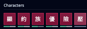
The bright border on the sectons of the progress bar for the recently learned characters/words makes seem like the whole bar is filled compared to the unlearned ones. I tweaked the css for 族 as an experiment and removing the border for the gray part might make the progress bar easier to read. (see screenshot)
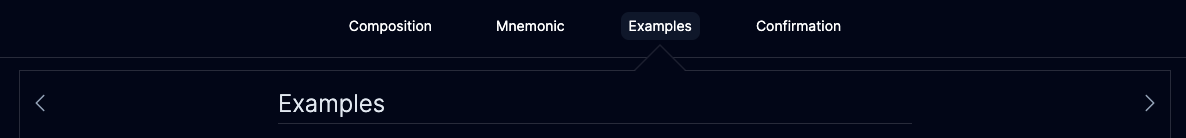
The contrast on the selected tab vs the non-selected tabs when learning an item is pretty low, and the arrow isn’t obvious either. Of course, the actual title is there, but it does trip me up a bit when I’m trying to navigate to the other sections.
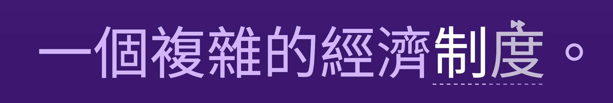
This is probably an extreme nitpick but the “light” color of the sentence vs the “light” color of the skipped character are different. In the screenshot here you can see 度 is gray while the rest of the sentence is slightly purple/pink. It feels a bit strange, but that’s all. I think someone also has commented before on confusing the skipped characters with the rest of the sentence, not sure what a good solution that would be.
This is probably an extreme nitpick but the “light” color of the sentence vs the “light” color of the skipped character are different. In the screenshot here you can see 度 is gray while the rest of the sentence is slightly purple/pink.
For the third option where the skipped character’s coloration is different from the main sentence’s coloration, for me I think that’d be helpful because sometimes I don’t notice when the skipped character is part of the word I’m recognizing (as opposed to be a part of the sentence). This way, because it’s subtle enough, it helps without being too noticeable. Just my perspective though!
The light mode and the colors of the tiles can be very bold – they’re super saturated
I upped the contrast between the two, let me know if it is sufficient or we need to go even higher
Thanks for the suggestion! The progress bar for the tiles has been updated to remove the border. Originally I thought having some sort of border would help indicate the tile is “active” but the green tile seems sufficient for that
Yeah, the Targeted Sentences need to be revisited. The slight discoloration found in dark mode helps differentiating between the sentence and the word, though I do hope we can find a more aesthetically pleasing way to fix it
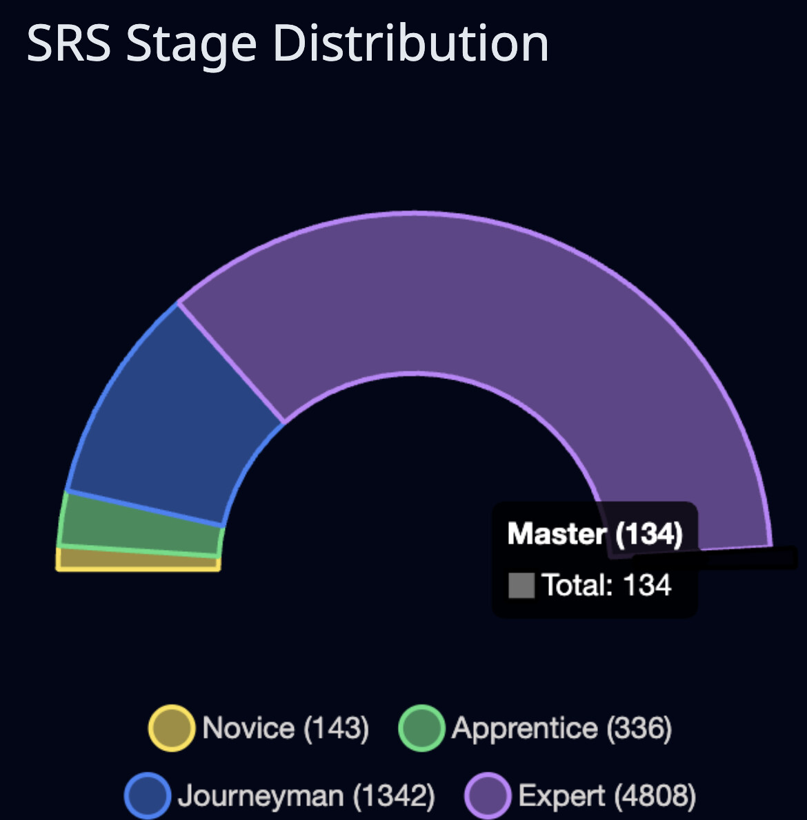
Love dark mode. Small tweak may be needed for the “Master” section of the pie chart to be visible. Either a more visible outline or a different color. I have about the same number of Novice items as Master for reference so I’d expect a slice similar size to the Novice (yellow) slice.